Academic Work Fragmented Across Disconnected Tools
Read the full context
University study workflows are commonly divided across learning systems, personal notes, file links, group chats, calendars, and general-purpose AI tools. Each tool holds only part of the context, forcing students to repeatedly reconstruct which information belongs to which course. This fragmentation makes previous material harder to retrieve, separates discussions and meetings from course content, and obscures what has been completed or needs attention. Generic AI tools also lack access to the student’s selected courses, notes, and resources, reducing the relevance of their output. The product needed to preserve the student’s identity, academic structure, and saved activity across sessions while connecting individual study, collaboration, planning, and AI assistance to the same course context.
The idea
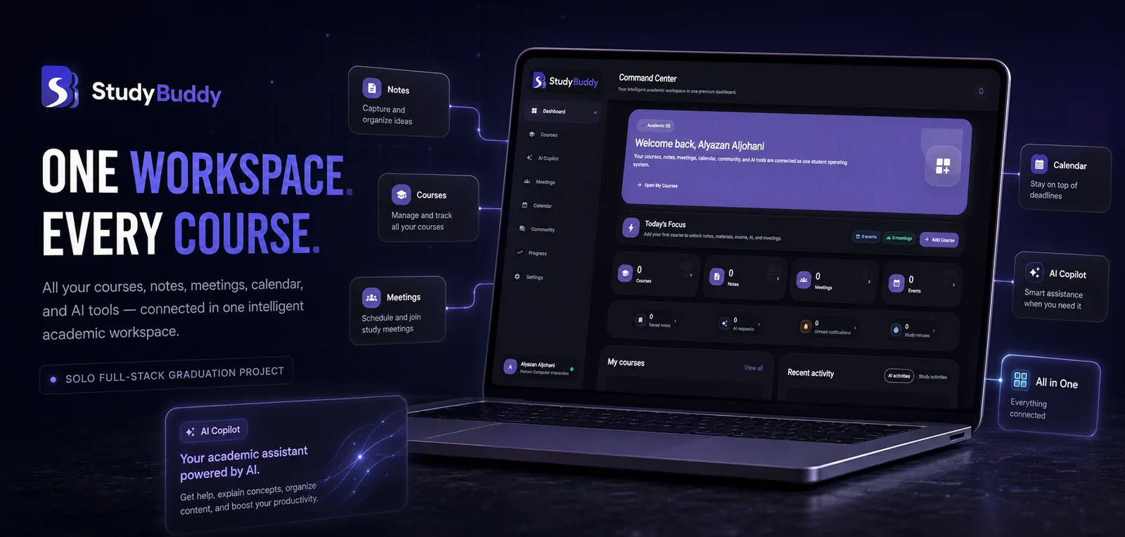
I built the product around a persistent course hub, then connected account identity, academic content, collaboration, planning, and AI assistance to that same context.
Product Strategy
UI/UX Design
Flutter Web
Express API
PostgreSQL & Prisma
Authentication
AI Integration
Deployment
01
Account & Identity
Email registration, real verification codes, Google sign-in, password recovery, session validation, and protected routes create a complete account lifecycle rather than a visual-only login flow.
02
Course Workspace
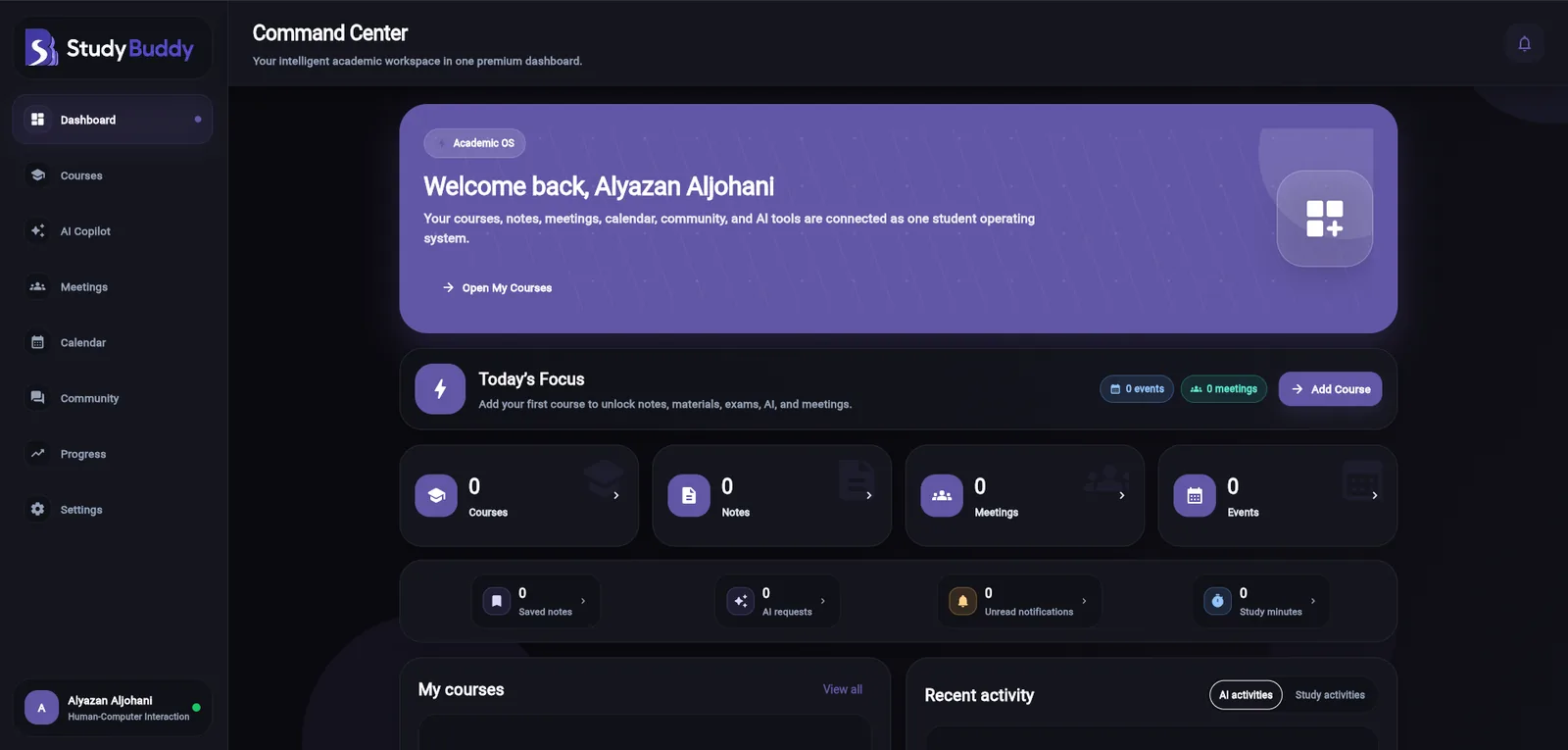
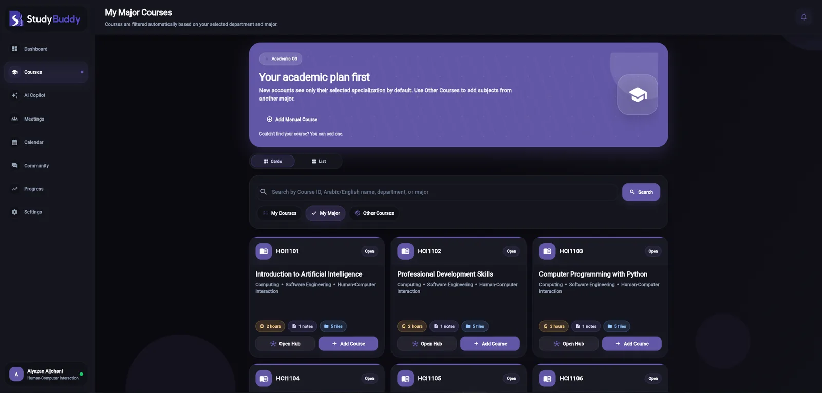
Courses connect notes, resources, past assessments, discussions, meetings, events, saved content, and progress. The dashboard aggregates activity while preserving the original course context.
03
Course-Aware AI
The backend retrieves accessible course material and recent conversation context before calling Anthropic. Generated explanations, summaries, quizzes, and practice exams are saved only after user confirmation.
04
Inclusive Responsive UX
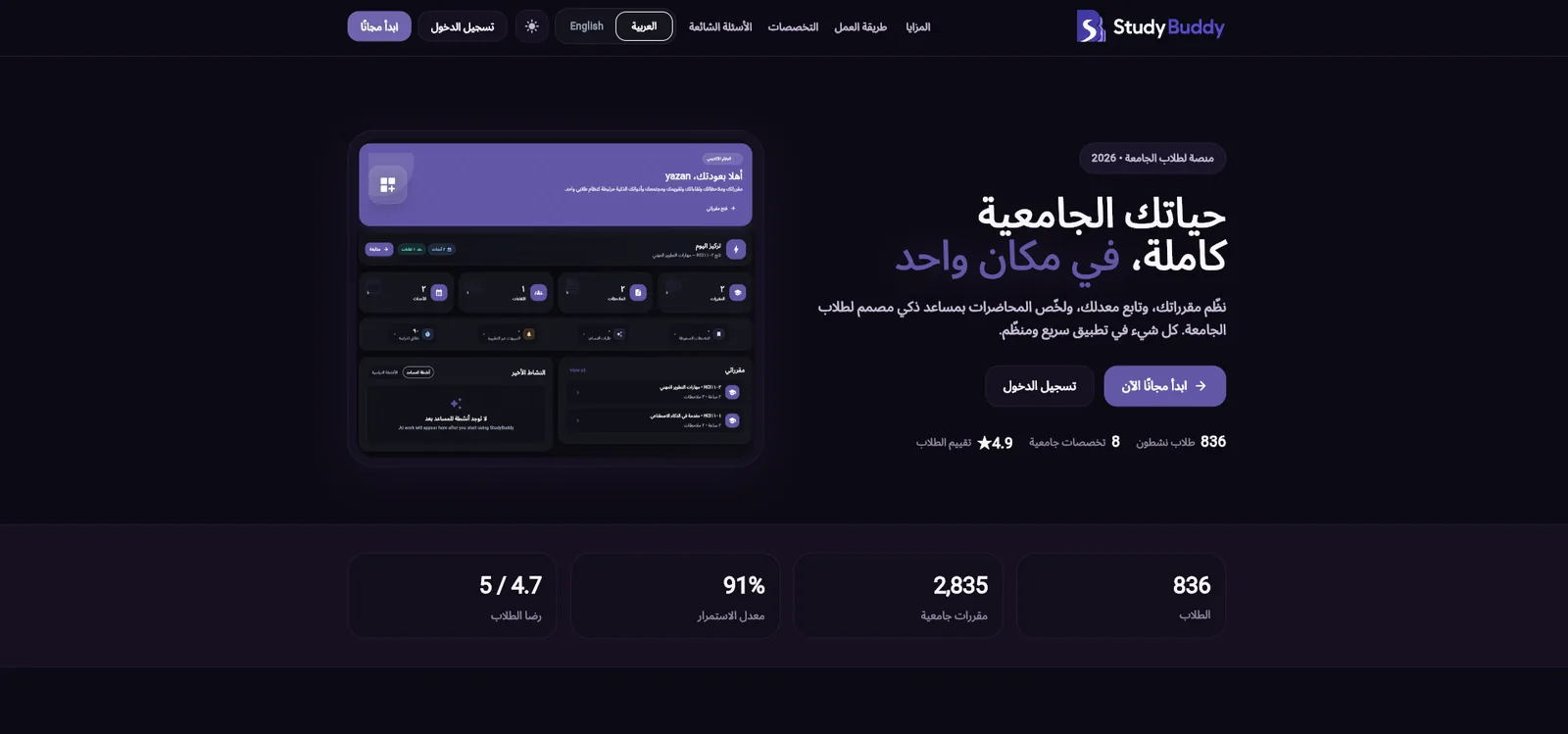
The interface supports desktop, tablet, and mobile layouts; Arabic and English; RTL and LTR; light and dark themes; high contrast; adjustable text size; and reusable loading, empty, error, and retry states.
Walkthrough
See the connected academic journey in action.
A complete product walkthrough covering the public experience, account access, the personalized dashboard, course workspaces, learning tools, and responsive interface states.
Design decisions
Three decisions that connected product structure, account reliability, and inclusive interface behavior.
01
Organizing the Product Around the Course Hub
Why?Reduces context switching and gives every action a clear academic context.
The course was chosen as the primary unit of product organization instead of treating every feature as an isolated destination. The relational model connects each course to enrollments, notes, resources, discussions, meetings, events, progress, and AI conversations, while the interface exposes these systems through a unified course hub. This reduces context switching, gives every action a clear academic context, and allows the dashboard to aggregate activity without losing its connection to the original course.
02
Building a Complete Account Lifecycle Instead of a Cosmetic Login
Why?No session before the email is verified: a real account lifecycle, not a login mock.
Registration and account activation were separated so a newly created email account does not receive an authenticated token before verification. Passwords are hashed with bcrypt, email codes are HMAC-hashed rather than stored in plain text, and each code has an expiry, consumed state, and attempt limit. The system also links Google identities to existing users, returns a generic forgot-password response to reduce account disclosure, and protects frontend and API routes independently. This created a complete account lifecycle rather than a local sign-in mock.
03
Treating Responsiveness, Localization, and Display Access as Interface Architecture
Why?Layout, language, direction and display settings are handled centrally, so every screen stays consistent.
Mobile behavior, Arabic support, and display preferences were treated as system-level concerns rather than late visual patches. Central breakpoints control navigation, spacing, cards, dialogs, and typography across device classes, switching between full and compact sidebars and a mobile drawer with bottom navigation. Locale, direction, theme, contrast, text size, and number style are also managed centrally, alongside reusable loading, empty, and error states. This keeps the experience consistent without solving each screen independently.
On mobile
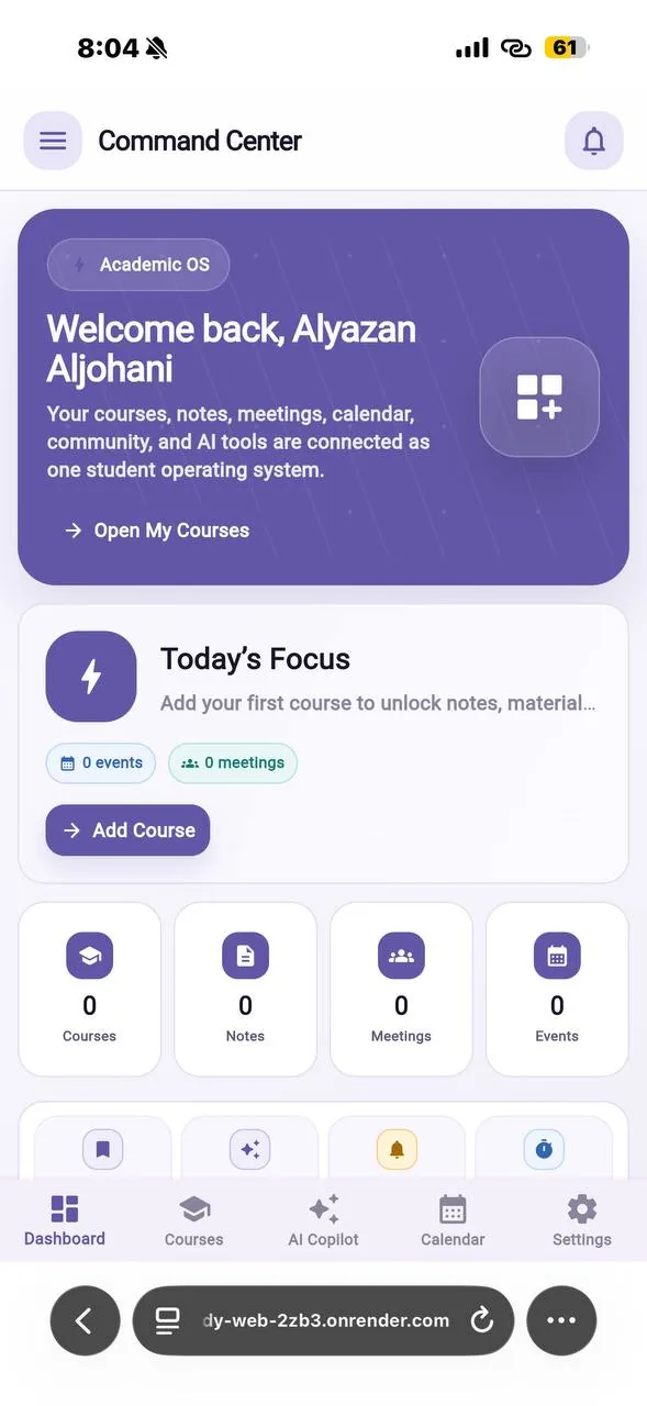
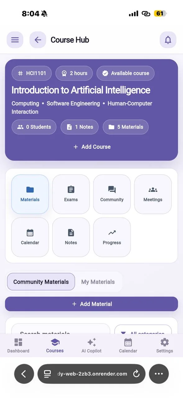
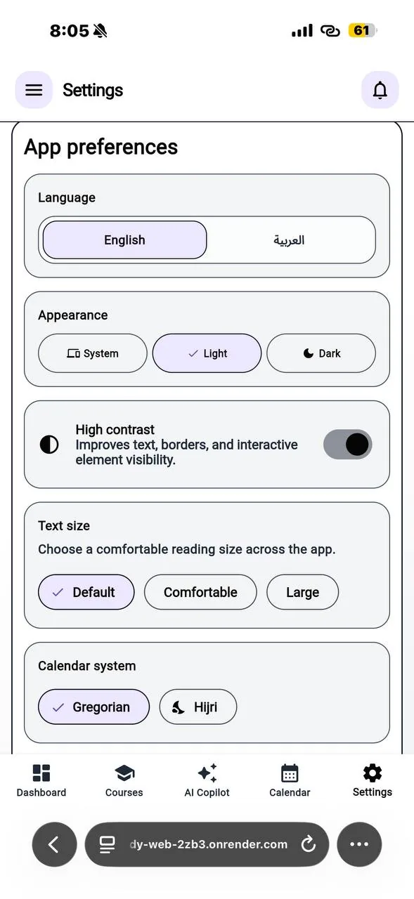
StudyBuddy Across Desktop and Mobile
Responsive DashboardThe primary dashboard adapted to a compact mobile viewport.
Mobile Course HubNotes, AI, community, meetings, resources, and progress remain connected on mobile.
Display & AccessibilityLanguage, theme, contrast, and text-size preferences in one settings surface.
Verified email, Google sign-in, password recovery, and protected frontend and API routes.
Relational course data persisted through Prisma and PostgreSQL instead of temporary interface state.
AI requests are assembled on the backend from authorized course context and confirmed before persistence.
Reusable asynchronous states and responsive RTL/LTR layouts cover the complete product journey.
Validation
Account creation, email verification, password recovery, Google sign-in, and session-expiry flows were exercised end to end.
Responsive behavior was reviewed across desktop, tablet, and mobile in Arabic and English.
Production deployment verifies the connected frontend, API, database, and email flow.
Outcome
A Working Academic Product Delivered Across the Full Stack
Read the full context
The delivered result is a deployed web application that supports the student journey from account creation through course management, academic content, collaboration, planning, progress, and AI-assisted study. Its central modules are backed by authenticated APIs and related PostgreSQL records rather than temporary frontend-only state. The project demonstrates a functioning account lifecycle with email verification, Google sign-in, and password recovery, alongside a course-aware AI assistant, shared notes and resources, course communities, meetings, calendar planning, and progress analytics. I independently owned the product from information architecture and UX design through Flutter Web, Express, Prisma, Google and Anthropic integrations, email delivery, responsive and bilingual behavior, display-access settings, deployment, and final system integration.
Constraints
Solo graduation project: product design, frontend, backend, data model, and deployment were independently delivered.
Email and AI features depend on external services, so failures and expired sessions require explicit recovery states.
Formal usability testing with real participants was not claimed; the portfolio reports implemented validation only.